One Stop Solution App for Inventory Management
Designing a mobile app MVP.
Written by Gde Juliartha

Photo by shen liu on Unsplash
In 2023, I designed the MVP product of a start-up with a mission to help restaurant owners, especially those who have two or more outlets, improve their inventory management. They saw that entrepreneurs in the food and beverage (F&B) industry need more accurate and easier inventory tracking. Inaccuracies in inventory tracking could lead to waste, inefficient supplier ordering, and at worst, lost sales. I designed an MVP to support restaurant owners manage their inventory and make better decisions.
Getting Initial Understanding to Define the Solution
The F&B industry and this type of SaaS product was quite new for me at that time. The earlier phase of the project was spent to get to know the problem and product thoroughly. I started by interviewing the product lead and conducting heuristics analysis of the early beta version. The product team had defined several use cases for different types of users/roles. There was the owner role and the stock admin role. The owner role was in charge of supervising the inventory, meanwhile the admin was updating the inventory. Then the problem statement became clear: how might we help them, especially the owners, to oversee the whole inventory better?
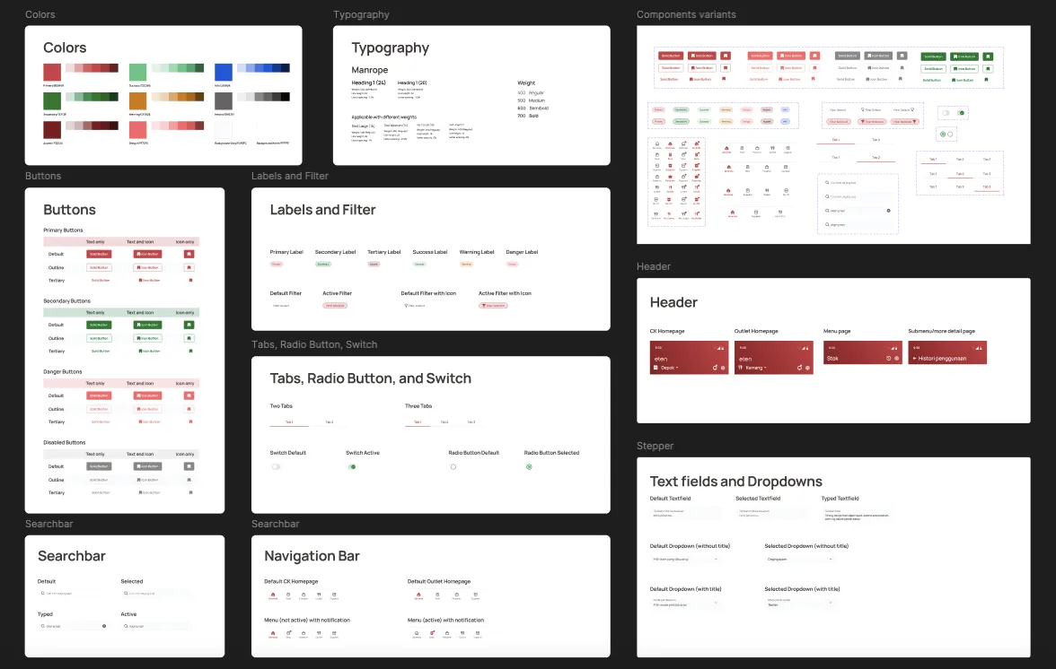
UI Kit for the app. This include typography, color palette, and standard components with its status variants.
After defining the how-might-we, I designed the user flows in the app. Before doing UI design, I prepared wireframes for each user flow and a custom UI kit aligned with the brand. I used the wireframe to communicate my detailed user flows and get approval so we can move to the design phase with the same product in mind. Later on, I also led the user testing initiative to gain initial insights from select F&B entrepreneurs with the client’s target market criteria.
Designing for Better Visibility and Decision Making
The core idea of the app was promoting better visibility into stock status. If owners could see at a glance which items were low or expiring soon, they would act on it. The home page dashboard prioritized status labels over inventory lists, showing owners at a glance what needed attention. To make that visibility actionable, users needed a frictionless way to update stock numbers. So I designed a simple edit flow: tap the pencil icon, update numbers, confirm. The confirmation step prevented costly mistakes. Users could also see the last update timestamp to verify whether the inventory had already been updated that day.
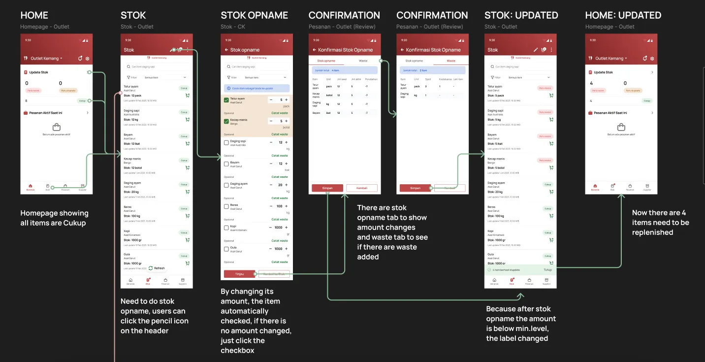
The user interface and flow of updating item amount as part of the inventory management flow.
Besides being designed for the manual inventory tracker, the product also prepared for future development roadmap by adding a feature to browse nearby suppliers. Users could replenish items by making orders to suppliers registered in the app. This feature positioned the app as a one-stop solution for restaurant owners to handle their inventory and supplies.
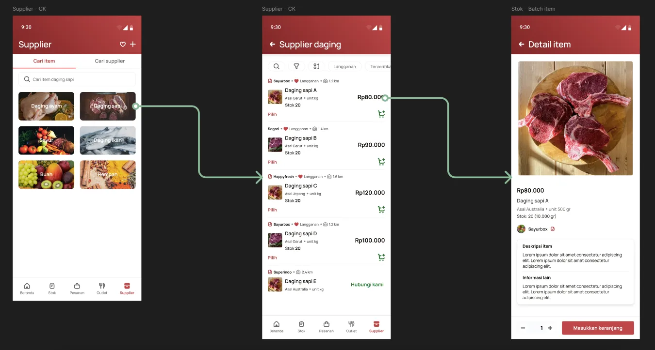
Users can browse for items and suppliers in order to replenish their inventory with this feature.
Learning and Conclusion
One of the challenges of this project was balancing the app UI with the information and functionalities. How to make the users operate the app easily while still dealing with numerous food items? Maintaining a clear visual hierarchy was important to make the app both functional and easy to navigate.
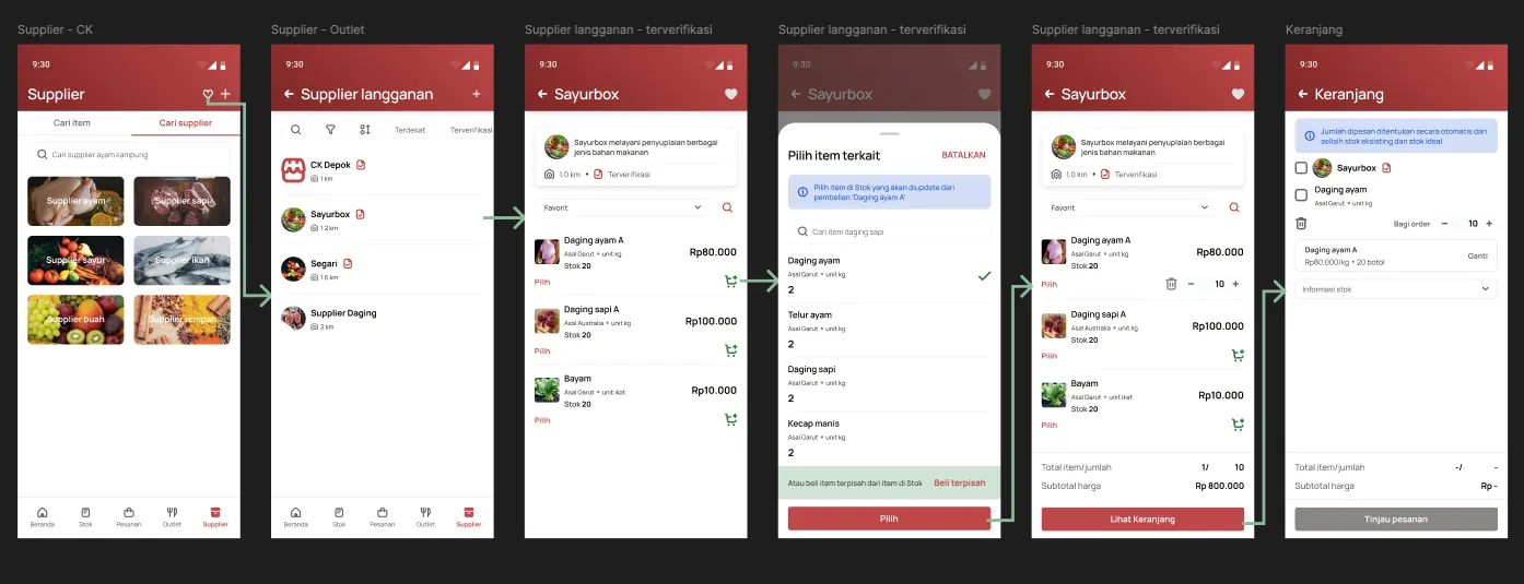
Make an order to supplier flow included an “item matching” step in order to automatically update an item amount when the order arrived. Clear visual hieararchy was needed here to make a tedious task resulted in seamless flow.
We discovered valuable insights during user testing about our users’ behavior when interacting with the app and practices when managing their food inventory. For example, I initially designed single-supplier orders to avoid payment term complications. But during user testing, restaurant owners showed me they work with multiple suppliers per order, which is a workflow my design wasn’t supporting. I iterated the flow to allow multi-supplier ordering, which reflected how they actually work.
This project taught me that in operational tools, visibility drives behavior. The app succeeded not because of fancy features, but because it showed users exactly what they needed to know, when they needed to know it. It also reinforced the importance of validating assumptions through user testing and iterating the design based on the insights.